
ISSUE: Summer 2018
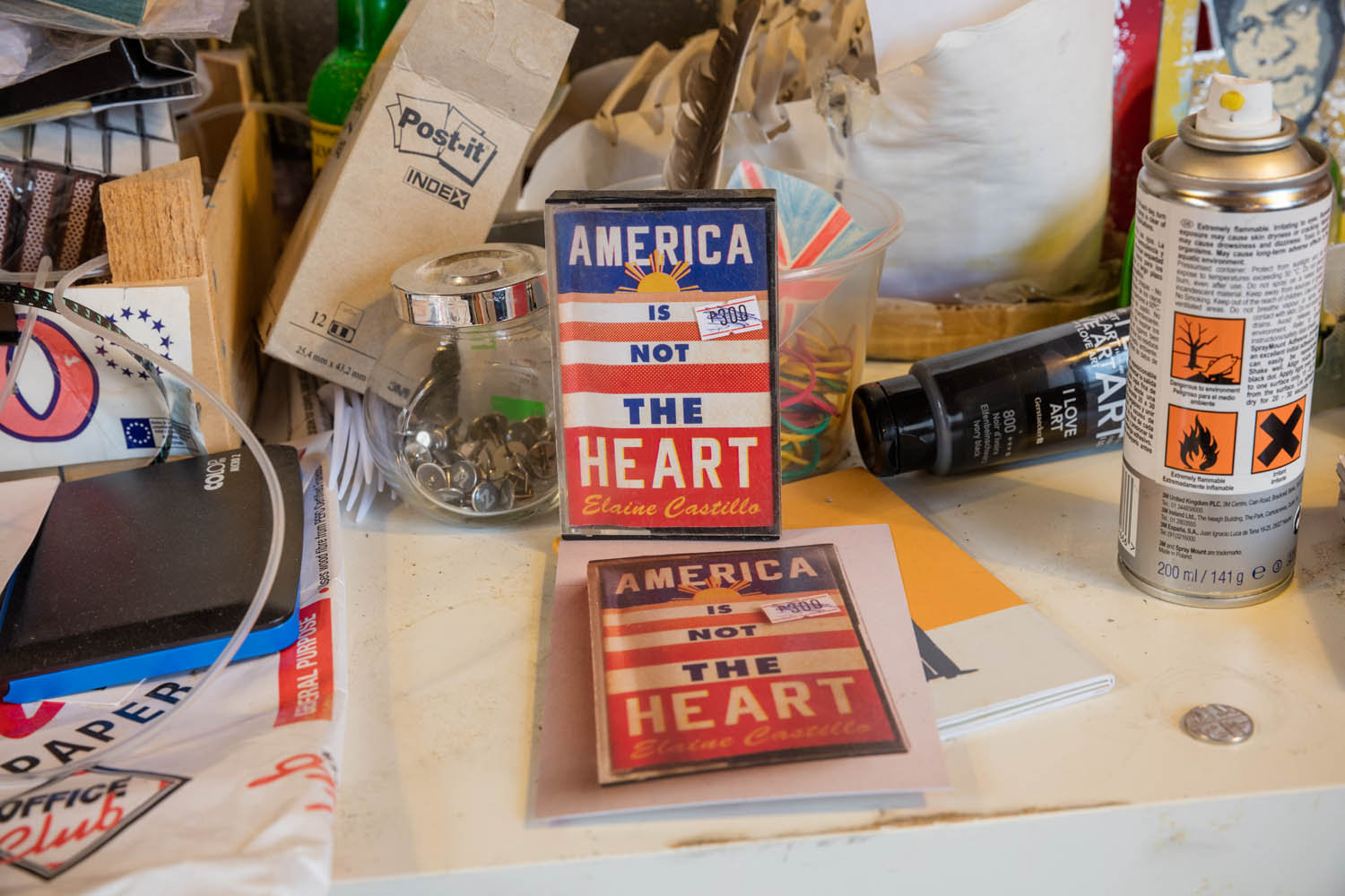
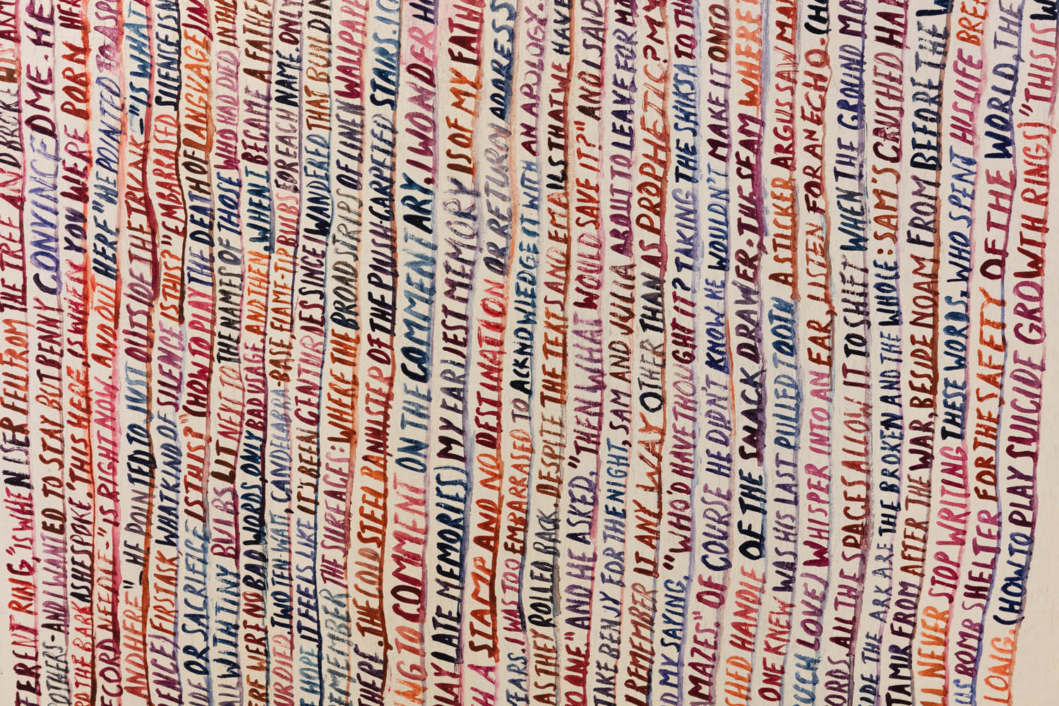
Somewhere along the way, still early in his career as a book designer, Jon Gray began to grapple with the fact that he just couldn’t get fonts to do what he needed them to do. He couldn’t get the letters to behave. So he set aside prepackaged typefaces and began lettering titles by hand, and in doing so discovered a style that has made him one of contemporary literature’s most esteemed illustrators.
“I’m not very good at handling typography in a designer’s way,” he admits. “The letter forms, I can’t necessarily make them work for me if they’re set. If I draw them, I can bend them to my own emotional use. As someone said to me the other day: ‘You design as a reader, not as a designer.’ And I think that’s true.”
There are, of course, remarkable exceptions to his typographical approach, including covers for Alain Mabanckou’s Black Moses, Alissa Nutting’s Tampa, Jenny Offill’s Dept. of Speculation, as well as an almost innocently minimalist design for Albert Espinosa’s The Yellow World.

But Gray’s aesthetic signature derives mainly from alphabetic acrobatics, the ways in which the letters manifest in covers for Nathaniel Rich’s The Mayor’s Tongue, James Frey’s Bright Shiny Morning, David Foster Wallace’s The Pale King, and, perhaps most memorably, Jonathan Safran Foer’s Everything Is Illuminated. Foer’s cover in particular is a good example of not just Gray’s instincts but, because of its phenomenal success, how a cover can become a visual shorthand for a particular time, an avatar of a moment in the culture.
Gray had done very little hand lettering before Foer’s novel came across his desk. “I struggled with it,” he says. “I’d done a lot of pretty bad covers—something like twenty of them—before the art director asked me to try something typographic. At the time, to me, typographic meant austere, set covers you’d see for poetry titles and that kind of thing. How was I going to convey anything of the novel through that? That wasn’t the novel I’d read. The novel I read had a sort of anarchic figure at its center. And how was I supposed to convey that in set type?”
Gray happened to be reading John Baeder’s Sign Language: Street Signs as Folk Art, which includes American church signs painted by pastors and reverends. “You could see their spirit in these signs,” Gray recalls. “And I thought that was perfect, exactly what I was trying to convey about the protagonist—to almost show the handwriting of that character.”
Illuminated was an unexpected hit, which meant there was little pressure on Gray to design something for it—a welcome relief. “Often you feel the weight of the in-house team,” he says. “You feel an expectancy from sales, from marketing, from editors. And you panic—and sometimes that helps, sometimes it doesn’t. With this one, I wasn’t afraid to try stuff out.”
 The book’s success raises an interesting design question. Among the varieties of relationships between books and their covers—good covers for bad books, bad covers for great ones, reissued classics that should’ve been left alone—the most curious example is that between a great book and the cover that has risen to its occasion. But does a book’s reputation make a cover better? Or does a cover color a reader’s perception, edging a good book toward greatness because of that first impression? Do covers actually prejudice how we interface with a novel?
“This is something I’ve struggled with,” Gray says. “I think it’s a bit like great albums. Some of those covers on great albums aren’t necessarily good, but it’s your associations with that album that make you feel otherwise. A lot of my work that people consider good is because the book is good. That association rubs off. I could be wrong; I like to think that some of my work has helped. But I really do believe that with a book people love, the cover sticks with them.”
Modesty aside, there is something to be said for how a book’s cover is measured by the way in which it stands out while serving something larger than itself.
“You don’t want to assign how someone reads a piece of literature,” Gray says. “You want them to inhabit it in their own way. So very often I’ll think I have to pull back, be slightly vague—just hint at a sense of the book. Often it becomes about taking details away. And type is very good for that. You’re not saying too much at all, you’re kind of just flavoring it. You’re giving some hint of personality to the book, but you’re not dictating the story.”
—Paul Reyes