
ISSUE: Spring 2013
I take them all off, the covers. As soon as I’ve paid—swoosh! Gone! I don’t have the heart to throw them in the garbage, but I certainly don’t let them muddle my beautiful hardcover books.
Contemporary covers can be rancid things. Littered with sales copy and discount stickers. They crumple, they tear, they smudge, they catch on things when you dump them in your bag. Once you embrace the serenity of coverless books you can never go back. Without covers, hardcover books become confident blocks of wood—they don’t shimmy or slide in your hands or atop tables. Try it. You’ll love it. You’ll never go back.
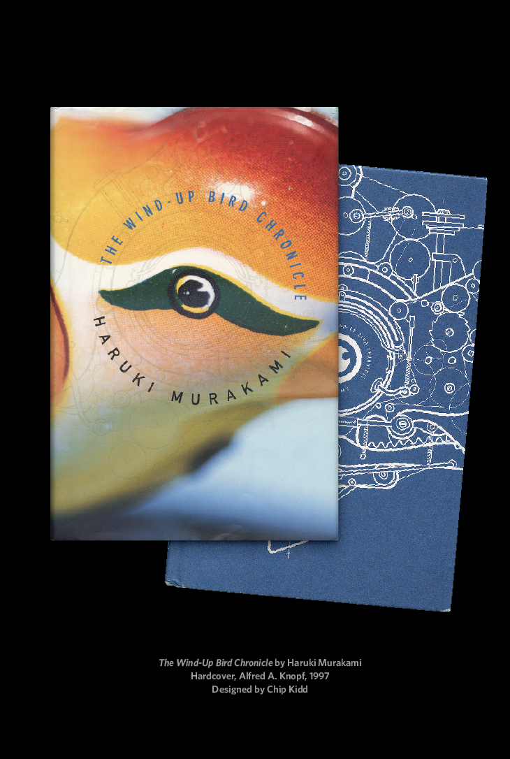
So it’s a rare and wonderful thing to find a contemporary book wrapped in something I just can’t remove. Or, rather, wrapped in something I love to keep on, to remove and replace, again and again, which is the case with The Wind-Up Bird Chronicle, my favorite book from Haruki Murakami. The cover, designed by Chip Kidd, contains only the barest of text: title and author’s name. No blurbs or quotes or synopsis. The surface of the entire cover, front to back, is a full-bleed photograph of an orange wind-up bird toy against a baby-blue background gradient. Geoff Spear photographed the toy so that most of it looms just out of focus. Only the bird’s eye—smack in the middle of the front cover—is sharp.
Despite such minimalism, the cover is alive. The circular path of the text, the positioning of the eye, and the sweeping patterns in the bird’s design pull your attention first to the center, then along the edge to the spine, inviting you to flip the book over and try to parse just what it is you’re looking at.
Now tilt the book: A translucent pattern shimmers across the surface. Look closer still and you’ll notice that it is, in fact, a mechanical schematic of the bird. Curious. So you unwrap the cover, and beneath it, printed in white ink on royal-blue chipboard, is a blueprint drawn by Chris Ware revealing the hidden complexities behind wind-up-bird mechanics.
Had they stopped here, Kidd and Ware and Spear could have claimed abject book-cover domination. But Ware goes one subtle step further to render the mechanics of the eye as a water well—an outer rim and an inner rim, abstracting the pupil into a perfect circle. The figure–ground relationship in this well illustration can be read in both directions: Either you’re at the bottom looking up and someone’s head is peeking over the top, or you’re at the top looking down, a small figure huddled against the well wall. Both are poignant to the story.
What a joy this cover is—its layers and materiality and physicality, made for print and print alone. In my library, it’s one of the very few hardcover books that has survived my rule—take them all off! Well, all except this one. Take it off and then put it back on.
—Craig Mod
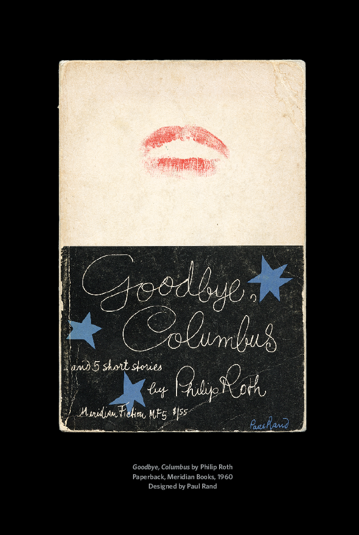
To pinpoint a cover that led to my career in book design is like looking for my passport when I’m late for the airport. I’d have to search everywhere, frantically. A more honest explanation is that every book I read from the age of fifteen led me here. In truth, I didn’t read many books when I was young; I was so uncomfortable with reading that I welcomed any distraction, and the most convenient was, of course, the cover. (Perhaps I believed that if I stared at it long enough, the jacket would reveal the story without me ever having to read it.) Fast forward a little, and I’m studying graphic design at New York’s School of Visual Arts. Like a rite of passage, I was introduced to the work of Paul Rand, a master of graphic design. At the time, I couldn’t articulate what made his designs so special, though now it’s clear, and I can explain it through one example: Goodbye, Columbus by Philip Roth. The elements on the cover are raw, almost childlike, but possess mature emotion. The lipstick kiss works as a sexy joke, with the title’s script complementing it by dancing around the page as ornamental decoration. This cover is joyful, fun, spontaneous. It exemplifies what I want for my own journey as a creative person. It also illustrates the process of finding solutions in design through what feels human—simple things like handwriting, or a kiss. And while my feelings toward Goodbye, Columbus have evolved, I consider the book a healthy reminder to keep ideas simple and to keep searching until I find a design that feels slightly familiar, that fits just right.
—Rodrigo Corral

Years ago, at a design studio in Florida, I got a chance to design covers for a set of textbooks. This was my first book-design gig, and through it I fell in love with the process and subsequently became obsessed with book covers—visiting bookstores, studying product on the shelves. Eventually I moved to New York and designed a few of Steve Almond’s early books for Algonquin. Browsing the stacks, glancing at what other customers were considering, it was a thrill to see someone pick up something I’d made, and better still if they bought it.
That kind of browsing is exactly how I came into contact with Emmanuel Dongala’s Johnny Mad Dog. In Los Angeles, years ago, I stumbled upon this novel at Book Soup, where Kwasi Osei’s arresting jacket practically called to me from an upper shelf in the fiction section. I was magnetically drawn to the punk-rock cut-and-paste energy of the dog’s head on the boy’s body. I loved the bubbly typography and how it juxtaposed with the figure holding the gun. I bought it on the spot. I don’t even remember the flap copy (who ever does?), but I devoured the story inside. In every way that it’s supposed to, Osei’s design projects the intensity of Dongala’s novel, nails the story’s pieces together. I often think about Johnny Mad Dog when working on book covers, since my goal is to replicate what it did for me—to make you pick it up off the shelf simply because you love the cover, then have it all make sense once you’ve committed to the story.
—Michael Fusco

If you aren’t a book-cover designer, then it is likely that you have not experienced the work of David Pearson, a London-based designer who has done extensive work for Penguin UK. A quick Google search for “David Pearson 1984” will lead you to what may be the best cover of the new millennium and one of the great reissue packages of all time. And this isn’t even the cover in question.
There are some inside jokes among book-jacket designers that we use occasionally to entertain ourselves. We like to work with the physical components of a book to create a book cover. Sometimes we’ll take a photograph of a book and use that on the cover (a book cover on a book cover), maybe put some of the first chapter on the cover, or put the back of the book on the front and vice versa. Very meta. I’ve tried them all up to and including utilizing the spine of a book as the cover’s centerpiece.
David Pearson’s cover for Walter Benjamin’s The Work of Art in the Age of Mechanical Reproduction—first published in 1936, and now part of Penguin’s Great Ideas series—utilizes the spine-on-cover idea in a way that is so smart and so precisely rendered that it makes other versions of this design trope seem labored. This is a case where the concept and execution are seamlessly in sync.
The cover not only reflects the author’s ideas about art and authenticity in the modern world but also deftly alludes to its own existence as a mass-produced object. The details are key. There is the repetition of the corporate logo and the smooth, uncoated paper stock with a subtle deboss that gives the individual spines some dimension and a trompe l’oeil effect. If you put the book face-out on your shelf it looks like you own fourteen copies, neatly set.
The clearest explanation of a good cover that I have ever heard came from Michael Beirut. I was a guest invited to critique a book-cover project he had given to his Yale students. As I was struggling to express some notion about why a particular concept may or may not be working, he got right to the point: “It has to look like what it is.” Indeed.
—John Gall
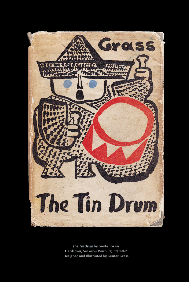
The book cover for Günter Grass’s Tin Drum represents everything for me that a good cover should. It’s not only a bold and beautiful design, it’s a cover that reminds me of a time and a space. A life-marker. It sat on my parents’ shelf next to Graham Greene, looking grown-up and exotic and probably a bit too clever for a little person to understand. But it looked exciting: the boldness and confidence of the illustration and type—as if the artist just picked up a brush and painted it on directly; the iconic Oskar and his vibrant red drum.
Later, as a recent graduate working at Minerva Books in London, I helped design the paperback covers for Grass’s novels. I knew nothing about Grass at all, I hadn’t read a thing. I was given a pile of artwork—just black-and-white drawings—and was told that this was the artwork to be used. Flipping through the stack, I came across the icon of the drummer boy and was immediately transported back to my parents’ library.
Grass himself drew or painted all of his covers, which means that what you get with his books is the total package, a world completely of Grass’s own making. To me this makes it incredibly personal and special, a gift. This is not unlike what I try to do with my own work, an attempt to make something bold and recognizable, but also individual—a personal invitation to the author’s world inside.
—Jon Gray