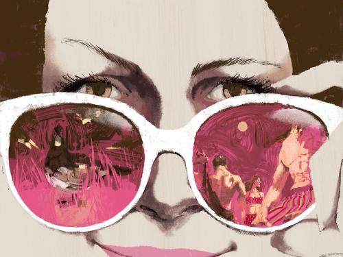
The common cliché aside, book covers do matter, especially in allowing individual titles to distinguish themselves from the masses of books on store shelves and display tables. There’s also an undeniable aesthetic appeal in a well-designed book cover, something that, if considered on its own merits, doesn’t have to affect one’s opinion of the contents within. Like many bookish types, I enjoy the visual created by lining up the blue or black spines of my Penguin Classics or grouping together some brightly colored NYRB titles. Attempts have been made to turn book design into high art, with various exhibitions around the world, but for this post, I’ll be looking at the more pedestrian, consumer variety.
My favorite book-cover blog is The Book Design Review. Run by a fellow named Joseph Sullivan, TBDR takes a designer’s view of book covers, and many of the blog’s commenters are designers and artists as well. The questions asked are rather basic ones: Is this cover effective? Is it beautiful? What about it works? What doesn’t? But the resulting debates—about typography, how to show action through illustration, use of stock photos, which designers are at the top of the heap (John Gall, Paul Sahre, Henry Sene Yee), design trends, and so on—have caused me to look at book covers and book design in new ways, appreciating the aesthetics of a finely designed cover and learning something about the market imperatives that may drive design.
Now I find myself looking to see if I can spot design flaws or trends. One common trope, for American nonfiction books, is to use the subject of the book to create a map of the United States. When done well, as in the first example below, which was praised by TBDR, it can create a beguiling, thought-provoking image. But seen alongside several of the same type, the subject-as-America image seems tired and overdone, reminiscent of the seemingly unshakeable rule that all nonfiction books published in this country must have extensive explanatory subtitles, preferably declaring how the book’s subject, however obscure, changed the world—i.e. Twenty Ads That Shook the World: The Century’s Most Groundbreaking Advertising and How It Changed Us All, Don’t Stop Believin’: How Karaoke Conquered the World and Changed My Life, or Why We Eat What We Eat: How Columbus Changed the Way the World Eats. And don’t forget: Flowers: How They Changed the World. These hyperbolic subtitles betray an irrational exuberance that only a paid marketing officer could fake. The effect with unoriginal book cover design may be slightly different, but it does offer this sense that there’s some sort of homogenization in play, in which we’re being told that everything is as dramatic, important, or foundational as everything else.

The end effect after looking at a scad of books with similar subtitles or “defining America” visual motifs is that some marketing departments believe that books can only be sold if they’re impressed upon the consumer as groundbreaking. The book is only worthwhile if it opens up some supposedly hidden, profoundly meaningful slice of life or history, like Freakonomics or one of Malcolm Gladwell’s books. Fortunately, with fiction, that kind of overwrought enthusiasm is conveniently isolated to the author blurbs, which are easily ignored, allowing designers more flexibility.
For an introduction to TBDR (which, to be fair, focuses more on aesthetics than harping on marketing schemes as I just did), I recommend taking a look at their favorite book covers of 2008. Before you go, feel free to post a comment with your thoughts on book design. Do book covers matter to you? Do you find yourself buying one edition of a book over another because of its cover? Is the whole subject moot because you only read on a Kindle?


