ISSUE: Spring 2004
“Yet for better or for worse we love things that bear the marks of grime, soot, and weather, and we love the colors and the sheen that call to mind the past that made them.”
—Jun’ichero Tanizaki, In Praise of Shadows, 1977
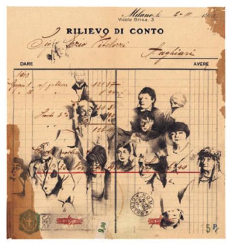
Imagine a young woman sitting in the accounts payable department of an Italian trading office in 1910. The afternoon is dragging interminably. She drifts into a reverie and starts to doodle on the invoice in front of her. Like many educated people of the time, she can draw with reasonable competence. She sketches the faces of her coworkers as she remembers them at the recent New Year’s fancy-dress party. The result of this graphic detour is a fascinating mixture of period commerce and art. Is it important that she never actually put pencil to paper and that it is you or I who decides to act out her part for her? Is the invoice worth less because we have created a fiction over a fact? Surely what matters is the degree of poignant emotion evoked by the resultant piece of paper. I love the idea of a creativity that honors the effects of time and makes mischief with history. Growing up in a society where hard, cold, and shiny are often highly valued, I find myself gravitating toward the opposite. Snow-blinded by bleached white paper, I crave smoky patina and shadowy aged surfaces.
The concept of order and chaos overlapping one another intrigues me. Whether it be vine-engulfed ruins or a new edifice emerging out of the jungle, there is something stimulating about the codependence of the contrived and the organic. Maybe that’s why many of us feel affection for weather-beaten, barnacle-encrusted ship’s figureheads or ancient sculptures with lopped-off arms and noses. As Walt Whitman put it, “The weed will win in the end.” It’s a pleasing idea, not because it takes pleasure in the ultimate demise of civilization, but because it is an affirmation of change.
I’m inclined to think that we, the children of the latter portion of the 20th century, bought the Emperor’s New Clothes when it comes to art philosophy. We’ve accepted a line of thought implying that aesthetics are purely a matter of individual taste and personal whim. Ironically, in so doing we’ve laid ourselves open to be led by cheap fad. Though it may not be a popular view, I believe that there is a universal aesthetic, an internal visual balance mechanism that defines beauty and composition. This means that the opposite is also true—equality is admirable, but why kid ourselves that ugly doesn’t exist. Awareness of balance and harmony is something that needs to be worked on and developed within us. As much as I respect the well-lit giants of the Renaissance, I’m not making an elitist plea for “high art”; on the contrary, my work tries to show that good art can be found in many a dark corner. It just has to be discovered, played with, nurtured, and appreciated. Only when we develop a strong sense of the aesthetic within the everyday will we avoid having crude and clumsy uglification served to us in the name of art and personal taste.
Faux Mail
I can’t make up my mind if mail art has to pass through the post in order to make it “official.” If it does, anyone depositing their precious work in the postbox runs the risk of losing it to the postal ether. If the art doesn’t have to be posted, what defines it as mail art—the fact that it’s attached to an envelope? That seems an incredibly open-ended definition. My interest is a bit more specific: faux mail. Faux mail, according to me, is an envelope that has artwork added to it after it has already been through the mail and earned its maturity.
By working with old, used envelopes, I find I’m dealing with a form of precast truth—something that has already received its markings and cancellations and gone through a rite of passage. It bears history as a duelist carries his scars. Of course, I could simply leave these envelopes as pieces of postal memorabilia, but where’s the entertainment in that? I like to view an old envelope as an interesting starting point with grounds for improvement or, to be more provocative, as an opportunity to tamper with the mail. The best examples of faux mail are not merely decorative but reactive to the surface they reside on. They express a thought, a feeling, or an idea in both their style and their content.

The Postman’s Nightmare
Mail doesn’t always reach its destination. Sometimes it chases its intended recipient all round the globe. This piece of sheer chaos made a few detours, but the majority of its zigzag touring was down to me.
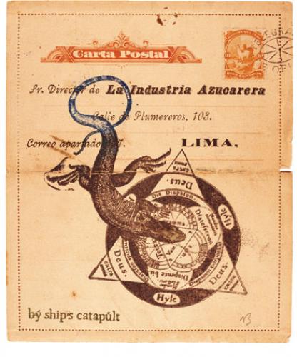
Lizard Lima
Most South and Latin American countries once produced very pleasing preprinted letter cards. The lizard rubber-stamping and the catapult mark help give the impression of a missive from a ship’s anthropologist.
Dubious Documents
Invoices, business forms, passports, visas, marriage and death certificates: there’s almost no end to institutional and commercial paperwork. Like most people, I get bogged down by the weight of having to respond to this avalanche of dry wordage. The occasional disrespectful riposte directed toward an authority can be most satisfying, especially if the body in question is a defunct empire—with no one left to complain about any irreverences.
By their nature, official documents take themselves rather seriously, which makes them perfect for a little teasing. This can mean adding an unexpected image to the text or simply putting artifacts alongside one another for unexpected comparison. The addition doesn’t have to be blatant: some of these papers need close inspection to see what you can insert in the small print.
For some reason there seems to be a proliferation of 19th-century eastern European legal documents in Vancouver, where I live. I’m drawn to the multiple variations of elegantly stamped Austro-Hungarian administration details and their fine handwriting. In a few years they’ll be gone—distributed more evenly across the universe—but for now I can buy them cheaply.
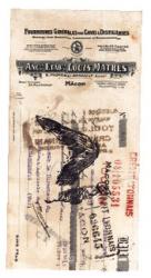
Bird of Prey
A French distiller and his (rubber-stamped) delivery boy, plus a Swedish fiscal.
<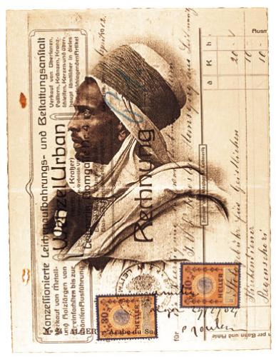
Alger
The image doesn’t have to relate directly to the text. In this case the mysteriousness of the link is part of the attraction.

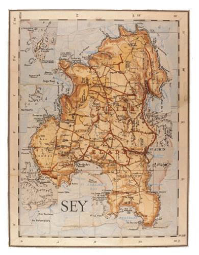
Maps
A couple of years ago I was in Denver looking around a store that sold old maps. The beautiful historical gems of cartography were either carefully framed or otherwise sealed from the elements. Even the oldest maps were amazingly well preserved and appropriately expensive. After ten minutes of quiet ogling, I sidled up to the storeowner and sheepishly asked if he had anything damaged and badly aged. He looked at me as though I were asking for a dry crust of bread in a five-star restaurant. I explained that I wasn’t a collector but I wanted the material for making artwork. (I tend to pump up what’s left of my English accent in cases like this because it helps portray me as eccentric rather than lunatic.)
This approach can lead to one of two responses: dealers consider my intentions sacrilegious (even though they will probably end up trashing the kind of stuff I want) or they become curious and want to know more about my creative endeavors. In this particular case, the latter variety of conversation ensued, and after a short while the owner descended into his basement and returned with a few small, heavily foxed maps. I glanced through the pile and plucked out a plum: a brown ink map of Egypt from the late 1700s. It was torn and distinctly worse for wear and at one point had been folded so that the left and right sides of the map had ghosted themselves onto their opposite halves. I loved it!