
ISSUE: Summer 2022
Traveling in Italy and Greenland in my teens and early twenties with a fitful and rudimentary cell phone, an impatience with the sweaty, masculine funk of internet cafés, and only the haziest notion of planning, I adored and relied on the magic of the general-delivery mail system—also known as the poste restante. For those who have missed the deep civic satisfaction and the personal, almost erotic thrill of correspondence in this format, it works as follows: You tell a potential correspondent where you are likely to be in the near future. They send you a letter, marked poste restante with the address of the post office on the envelope. (I advise a bold, all-caps handwriting with heavy underscoring, though this is nowhere in the rule book.) You lurk around this post office for a few days, trying not to unnerve or annoy the desk employees with too many visits, until your treasure arrives. If your dromomania strikes again and you move along, you will inevitably fail to encounter some of these letters, which will reach your previous town after you’ve already gone and will slowly yellow from missing you.
Together, such letters comprise the poste restante, the post that stays. And unless they are picked up, then like Sleeping Beauty or like Frankenstein’s monster before the galvanic spark, they will lie unawakened, returned to the sender or abandoned to a returns center indefinitely. Whenever a pay phone rings in a movie and there’s no one to answer it—a phenomenon I remember vividly from childhood summers at the local swim club, where the heavy, black handset had absorbed the smell of hot dogs and was always mournfully trilling under a cinder-block breezeway—I feel this same tug of romance and sadness, which I know to be childish and luddite but no less unshakeable for that. It is frustrating and lovely that some forms of communication are directly tethered to their physical destinations, that to step away from the place means to miss the message. When we lose this small, charming burden and can be found and spoken to everywhere, we also lose some of the material fixity of communicative exchange.
Many of my favorite works of American art have this quality: a sort of epistolary aura, and an obstinate tendency to land in a specific place. This past winter in Chicago (at the Art Institute), and now this summer in New York City (at the Morgan Library & Museum), a revival of Ray Johnson’s work is afoot. Johnson (1927–1995), born in Detroit and trained in art at the famed Black Mountain College, founded the so-called New York Correspondance [very much sic] School (NYCS), a loose and impish affiliation of artists, writers, and weirdos keeping up a mixed-media, polyphonic conversation through the US mail from the early 1960s through the 1990s. People interested in corresponding with Johnson would hear through the grapevine that they should mail him a postcard, and would generally get a form letter or questionnaire in response. (Johnson’s epistolary questions had a gift for whatever the opposite of preliminaries is, e.g., “Wanna see a box of a hundred snakes?”) For those intrepid enough to put up with this bit of minor negging, a two-artist, slow-motion collaboration ensued: penpalhood as performance. Correspondents received letters in the mail onto which were fastened items as varied, grungily mundane, and un-postal as cockroaches, eyelashes, dried spit, and rusty nails.
“Mail art” flourished in different guises throughout the twentieth century, from Marcel Duchamp’s Dadaist postcards to a flummoxed neighbor, to On Kawara’s telegrams reporting simply that he was “still alive.” Johnson’s friend and fellow mail-artist Ed Plunkett quipped that the first mail-art piece debuted when Cleopatra had herself rolled up in a carpet and sent to Julius Caesar. (Elizabeth Taylor has a particularly coltish and funny way of pulling this off.) But to me, Johnson’s version has a specific, quirkily domestic, appeal—it produces fetchingly vulnerable works of art, only as robust as their handlers. Change your apartment and a letter from Johnson or another member of the NYCS might miss you, or it might reach you eventually by live courier from some other member of the “school,” who would haunt your haunts and bother your friends until the transfer succeeded.
Johnson conceived of some of his mail art as though they were books unbound. The individual pages, though they flew hither and yon to different addressees, still existed in the mind as a conceptually bound, if geographically dispersed, volume. Johnson’s project A Book About Death (1963–1965) is like this: By mailing out copies of different individual pages to different correspondents, he managed to mimic one of death’s signature features, that no one really gets to comprehend one’s own in full.
Some of his projects and collaborations seem to resemble the fundamental quality not of the letter but of the envelope, that raiment and also the striptease of every message. He worked with Diana Epstein and Millicent Safro to design their Tender Buttons shop, a literal button store on the Upper East Side that was also a living museum and something of a fifty-year performance piece. Buttons close off, but also announce, a garment. Loosed from textile and stashed in jars and inventory cabinets, set free as merchandise, or distilled down to the Pop-Art practicum of Johnson’s cheeky instructional flyers on “How to Draw a Tender Button” (there are nine steps, clear enough for a kindergartner to follow), they become altogether different entities: more like punctuation marks eagerly awaiting the author’s deployment (Please—but please—write a breathless and em-dashed parenthetical!) or ghosts of aesthetics past, now languishing restante.
It is said that when Josef (1888–1976) and Anni Albers (1899–1994), Bauhaus artists fleeing the Nazis in the 1930s, received a letter from Philip Johnson (no relation to Ray) inviting them to teach at Black Mountain, they somehow thought he meant a place in the Philippines. Anni herself liked to repeat this story, one I find hard to believe unless they somehow thought that their correspondent, Philip, was the Philippines’s eponymous four-hundred-year-old Spanish king incarnate, gout and all. When eventually they found North Carolina on a map, they were relieved: It was not an island, and, by their reckoning, it looked extremely close to Mexico, a place they would later visit and come to love. Off they went, where they would be, among many other things, teachers of young Ray. Anni would lead the weaving and textile workshop, while Josef would run the visual-arts program.
I am tickled by the image of these top-shelf visuospatial thinkers so hopelessly befuddled by elementary geography. And I love thinking of brains functioning on such a liberated, cosmic scale that Asheville really can seem like it’s just up the garden lane from Aguascalientes. But I recognize the koanic truth likely undergirding Josef and Anni’s seeming artlessness: that correspondence (mail) invites correspondences (metaphorical thinking), invites us to hurl a material bit of ourselves out across the planet with as much innocence and candor as we can muster. Hard to do in a darkening world riddled by war and oppression, then as now.
Though it’s perhaps cheating to lean too heavily on titles, Anni Albers’s weavings, such as Ancient Writing (1936) or Open Letter (1958), have that quality of mailing forth, of communicating within the specific constraints of space, that seems to me emblematic of my favorite works of American art of the past hundred years. Ancient Writing, made during her first few years as an immigrant in America, is woven in black-and-beige, but almost overwhelmingly black—a lovely, wavering, and highly varied black like a humid night sky that is simply stars obscured, not gone. Within this, white rectangles and squares roll along every so often, occasionally grazing one another, mainly alone. It is a selective view of what “ancient writing” is, recalling those first Babylonian writings whose clay outer shells had to arrive unbroken to prove the message was untampered with. These messages are moored separately on the dark waters and it’s not clear how we get from there to a modern world of actual talking to, not just seals and secrets.
Open Letter, twenty-plus years later,is also a mostly black-and-white weaving, about two feet by two feet, almost the size of an opened newspaper. Though the color scheme is similar, the mood, the palpable desire to be read, is nearly opposite. It can in fact be “read” as fifteen columns, and indeed seems to ask for that kind of vertical attention. Its individual columns wobble and swerve on the horizontal, resisting that kind of motion except along the weaving’s top and bottom margins, which are grainy but regular, like the screens on old rabbit-eared TVs when a particular channel wasn’t spoken for and the noise of the cosmos leaked in. Amid the scholarly, austere quality of these black-and-white columns, there are a few quick phrases of caramel brown—five in all—that appear and as quickly vanish. The brown is the color of a partially mitigated bloodstain. Some of the black-and-white passages where the horizontal thread tries to defy the columnar setup of the work’s visual sense, tries to talk across columns, to look as plangent and awkward as orthodontia. We see this opened broadsheet, its undergirding decorous, processional, and correct, that allows itself every so often to get talky and jumpy, maybe lightly bruised. The leap between Ancient Writing and Open Letter feels like a commitment to a certain stance: of leaning toward us, slipping a scrawled note in our pocket or ringing a pay phone we might happen to pass.
Albers wanted to make sure we really got into things. In her extensive writings and lectures on art, she lamented that “our materials come to us already ground and chipped and crushed and powdered and mixed and sliced, so that only the finale in the long sequence of operations from matter to product is left to us: we merely toast the bread. No need to get our hands into the dough.” We have regressed in our tactile faculties, she thought, and the only way forward is by stretching, reaching, pinching, tearing, pressing. We owe these acts to our sense of beauty, which otherwise is hopelessly disadvantaged, trying to operate with one (perhaps both) hand/s tied. I wonder to what extent this conviction of hers felt ratified and enlarged by being in this strange, lumpy, and large new country, almost thirty times bigger than Germany.
I would venture to guess that when someone starts asking big, lumpy questions about what art is up to, they are probably in some kind of jam. In my case, the jam is this: When I am not writing, I work as a doctor at a coastal metropolitan hospital. I say things like coastal and metropolitan when describing my work habitat, but in fact one of the most salient features of modern American hospitals is that once inside, you could be anywhere, or at least any number of places. To rephrase Gertrude Stein, there is no “here” here. There are a great many psychic and structural barriers to feeling that I am in correspondence with the outside world, and I do not feel that I am grounded in particular space.
Thus, I live much of my life outside of what I think of as “epistolary conditions.” And during the past two years of pandemic, disease has made the hospital and the world more mutually impermeable than ever before. As a poet, I am a blue jay—or, let’s not get too highfalutin—a common crow: I steal eggs and nests; I get my nutriment from being nosy about what other people in other arts have done. In sympathetic circles, this goes by the euphemism of learning. You see how someone broke through an impasse with their painting or their sonata, and you borrow that move for your essay or your poem. These days, my problem is about feeling like I am truly in place, such that I can send and receive correspondence with the world.
There’s a three-line, untitled Lorine Niedecker poem I love: “Asa Gray wrote Increase Lapham: / pay particular attention / to my pets, the grasses.” A little song about two towering American naturalists, so frugal it forgoes the expected to in its first line for the more archaic (and immediate) way of simply writing someone, no prepositional fuss. And then it abandons all economy in order to revel in that big bauble of a word, particular, and the weird, private coziness of calling grasses pets. It almost rhymes, and sticks in the memory like one of those chants that are also rules, warranted or otherwise: Don’t step on a crack or you’ll break your mother’s back. A stitch in time saves nine. In the poem, we eavesdrop on a letter between American ghosts, and it sends us right back down to the actual dirt, to real grass and real land, as letters often do. And then, it earthworms its way into our ear, its loamy music a reminder to heed the call of the green pets around us, and the soil they root in.
Intra- and now post-pandemic, the microcosm inside the hospital has felt to me even more markedly detached from the “real” world outside, and the homogeneity of the hospital’s innards is even more pronounced. Fewer health-care workers are spotted in civvies; more have shifted, perhaps permanently, to scrubs that make us all look the same. Hospitals are slow to roll back all restrictions on patient visitation, and so fewer interlopers intrude. We have all, it seems, been retrained to keep face-to-face interactions briefer, quieter, somehow beiger than before. One is less likely to hear a brassy local accent or a keening clan, to smell forbidden French fries slipped on the sly to a recovering heart-attack victim who shouldn’t be eating that (but whose ingenuity I applaud).
More broadly, this has been true for a long while about hospitals. Since the mid-nineteenth century, our national medical culture has moved, with brief and sporadic ebb tides, toward sequestering sickness, debility, and death into marginal spaces like hospitals, clinics, and various institutional “homes” that both are and are not part of the world outside their walls. Of course I can leave, and with more ease and frequency than many of my charges. But leaving feels less like stepping off a sidewalk and more like being coughed out of a rabbit hole: that I am breaching worlds that only happen, this moment, to touch.
Standing in the middle of the Faith Ringgold show at the New Museum on the Bowery recently, I felt my sense of being placed coming back—that I was once again in correspondence with the world, that the “epistolary condition” was still possible. Ringgold (1930–present), the Harlem-born mixed-media artist and writer, works in maps, diagrams, and messages, something like a spy who’s given up all pretense of secrecy when it comes to sending off dossiers.
The gravitational center of the exhibition is Ringgold’s painted and inscribed quilts, dense multimedia accretions of inked handwriting, acrylic figurative painting, high-end silky and brocaded fabrics, dingy or garish clumps of corduroy and tie-dyed, silk-screened photographs, and the occasional tassel or other garnish. They are overloaded, but on a human scale, never much bigger than what an ordinary bed could actually accommodate. The best of her quilts function as letters, atlases, and directories at once.
In Street Story Quilt (1985), the units of a large apartment building form the basic grid of the quilt’s three panels, simple and bold as jack-o’-lantern teeth. But then you look a moment longer, and the whole thing begins to swim: Inky fire escapes and gutters break across the individual blocks, connecting or obscuring various human figures, while low, slinky cars eel around on the bottom of the picture. There’s been an accident on the street below—that’s what sets off the “story” recounted in the creamy lintels above each apartment window—and everyone in the building, it turns out, has been dying for something to look at and do, to feel the Aristotelian pity and fear that a good level-one trauma reliably delivers. The human figures in the windows are simplified and uniformly tipped forward, peering out the windows and down into the streets. The broad, shallow arcs of slightly foreshortened foreheads, chests, and breasts convey a swooning, passerine weight—gazes landing and bouncing all over the place, neighbors checking out neighbors and hearing through walls, rolling up curtains as matter-of-factly as tearing open an envelope.
It’s as we’re following their eyes that we start to notice the bizarre and enchanting range of window treatments in this building. Venetian blinds (from which eyes and nose peek), solid-white blinds, colorful patterned curtains parted or pulled taut, boarded and bricked and broken windows, windows with protest signs, windows with ghosts inside. The story unfolding on the lintels loops back and forth in time, killing people off and bringing them back to life, sending characters to Jamaica, to Vietnam, to Paris, and then reeling them back again with a story about their childhood in New York. The story is a bit of a mess. But the windows, with their curtains and their inhabitants, steady it all, give it an orderly mail-cubby vibe even as their contents tip and swoop as if about to land on the museum floor. The windows make a map for finding people, for helping them find each other. The building moves lurchingly through time from left to right, slipping toward dereliction even as its fundamental structure of brick and glass remains intact.
The narrative on Street Story Quilt is a fiction, but it is also a stunning reminder of how memory mapped tightly onto place endures in a different, deeper, and more voracious way than when we are not as geographically grounded. In her classic 1966 study The Art of Memory, Frances Yates recounts the classical technique, revived in the Renaissance, of the “memory palace” or “method of loci.” This art of spatial imagination purportedly aided Greek and Roman orators and scholars in memorizing reams of information by mapping cognitive markers onto a visualizable space that the memorizer could imagine moving through. According to Cicero, the first to discover this technique was the poet Simonides of Ceos, who briefly left a banquet hall, during which time the roof collapsed and everyone within was killed. When the bereaved needed help identifying the mangled, unidentifiable bodies, Simonides realized that by envisioning himself moving through the banquet, he could recall where each person had been placed.
Over centuries, these mnemonic devices became intentional and longer, such that memorizers might envision fantastical beasts or elaborate sculptures tucked within labyrinthine structures, all with the purpose of bringing our sense of space, our reading of terrain—likely among our oldest human faculties—to the aid of our relatively newer and feebler power of doing things with words. Ringgold’s story-quilts, loving and detailed maps of the crushed banquets of the heart, are pictographic letters from settings untimely altered. They ask us to remember place as palimpsest—its specific nowness as well as what it was. Here, the broken windows coexist with the curtained and peopled ones, the figures draped in shadow with the figures in full, frank lighting.
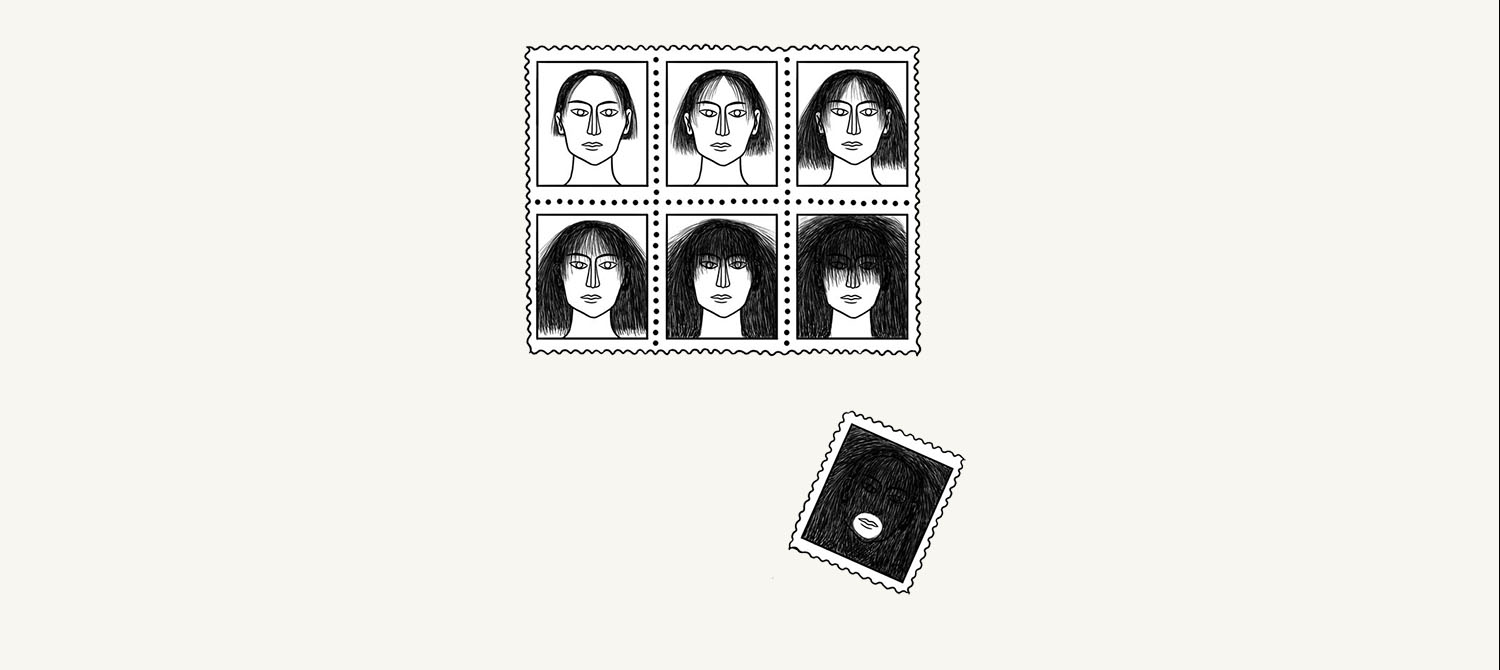
As if foreshadowing the quilt-dominated period in her work, Ringgold’s 1967 painting American People Series #19: U.S. Postage Stamp Commemorating the Advent of Black Power prepares the way in which her memory palaces will be circulated and seen. It is a large oil painting on which one hundred faces are painted in various hues, cropped from eyebrows to the tip of the nose (rather like the view of the human face that became customary during the pandemic, thanks to masks). Stepping back, you realize that the crimped black-and-blue motif at the edges of the canvas forms the perforations of a postage stamp—a letter to and from the country, bought and paid for. Stepping forward, you can make out that the white streaks lacing around some of the faces actually spell out the words white power, while at any distance you can see the bold capitals of the words black power. It doesn’t take an advanced degree in art criticism to see the simple, still-pertinent point that one kind of power is difficult to discern (though actually larger, in the space it claims on the canvas) while another appears to take up space more aggressively, though it is actually much smaller.
To me, what is interesting is the choice of the stamp as the theater for this parable. Stamps are mass-produced, of course, so retrofitting them to the old aesthetic of the gallery and paintbrush is a standard gesture of both Pop Art and the twentieth-century project of detritus reclamation more generally. But more important, Ringgold’s giant pseudo-stamp, studded with eyes like Juno’s peacock, calls to account the messages we send and the places we send them to and from. It is a reminder that people exist in place. And that to reach and be reached, we pay a fare and need an address. Without these, we cannot properly correspond to and with each other, and we will be lost.
My mother, a great wit, used the traditional geometric pattern known as “Storm at Sea” when making a wedding quilt for her brother and his wife in the early 1980s. As in a fairy tale in which curses can either expire, re-up, or change hands after a certain round number of years, my uncle and aunt regifted it to me and my husband forty years later. In “Storm at Sea” quilts, pieced triangles of different sizes create the illusion of restive curvature and depth, of whirlpools and swells. It is a funny thing to give a couple who’s hoping for permanence. Quilt historians say the pattern was designed to refer to the part of the Gospel when Jesus rebukes both the wind (for being too gusty on the waters) and the people (for being bothered by the wind and not trusting of God). Nature and the populace alike, Jesus says irritably, should just hold still.
But we need to move through space, it turns out, for the human memory to work properly. The paradox of the “method of loci,” the memory-palace technique, is that we map how we think and feel onto terrains, while in reality those terrains may be taken from us, or may alter with time. The epistolary strain in American art is maybe related to our fear of this. By emphasizing the power of art to function like a correspondence, pulling us back to specific places of address, asking us to pick up the post, this subplot or tendency in the past century’s art lets us reimagine communication as though it were a way of, however briefly and fantastically, holding the world still.